New fields: time picker and slider
Today, we're happy to introduce two new field types: time picker and slider.
Time picker
While it was already possible to create a time picker, it was only possible in combination with the date picker. There are many use-cases where these two elements need to be separated, or where a data is not required.
With the standalone time picker, you can define the time format (12 hours or 24 hours). You can set the interval between the displayed time options by setting the "Interval" option to a number of minutes. The default is 30 minutes. You can also restrict the selectable times by setting minimum and maximum boundaries and also unavailable times.
Slider
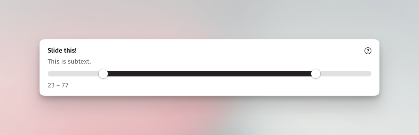
The "Slider" element allows you to implement a single or range slider.
Available options are "Min", "Max", "Steps", "Default value", and "Range." Handling-wise, it's pretty straightforward as you simply need to drag the handle(s) to either side.